Rosie’s Place
Rosie’s Place is a small not-for-profit organisation that runs counselling and support services for primarily children and young people who have been impacted by sexual assault and/or domestic violence. Rosie’s Place wanted to redesign its old branding elements and website and uplift it into the contemporary visual standard that a lot of Australian charities have been undertaking.
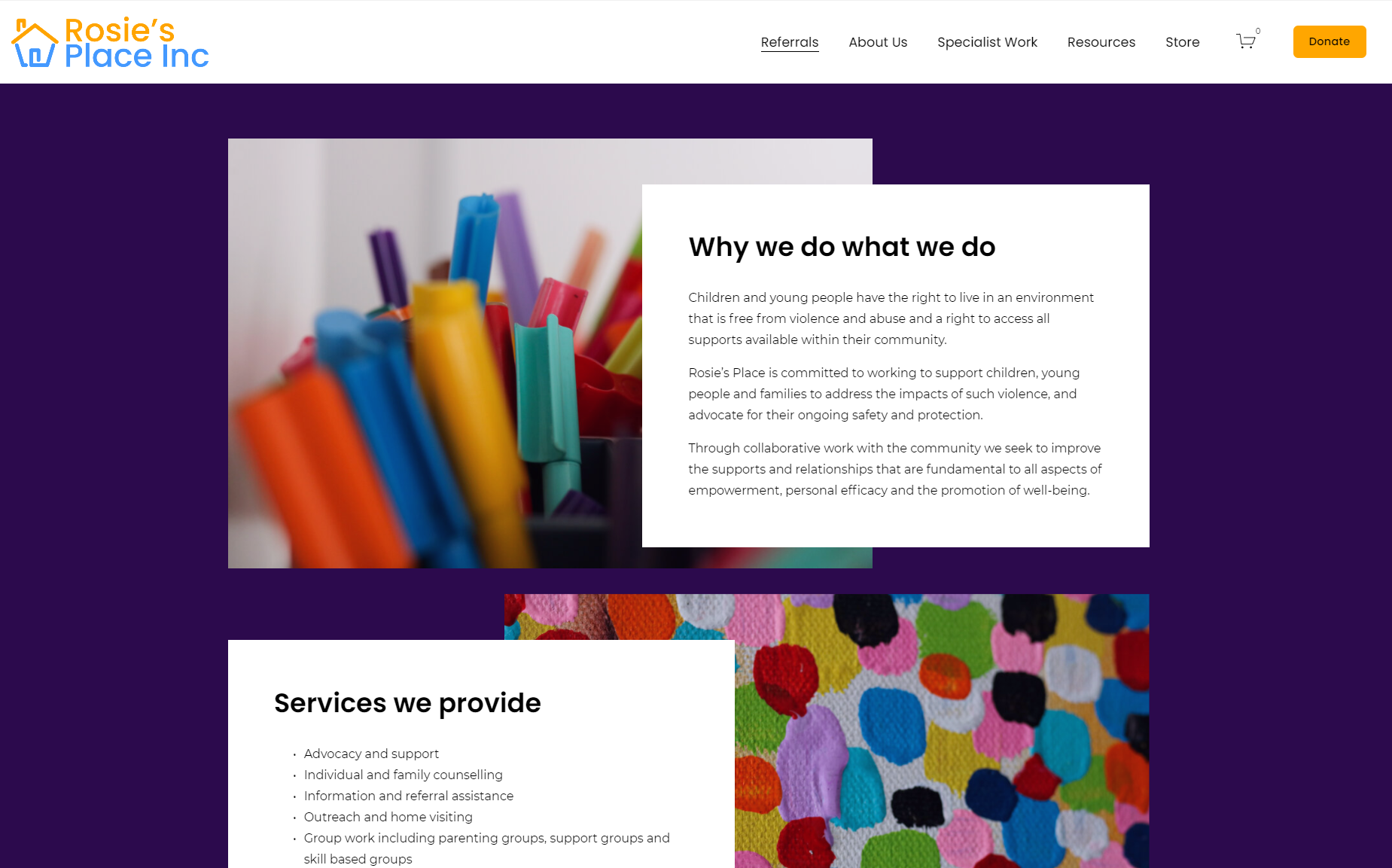
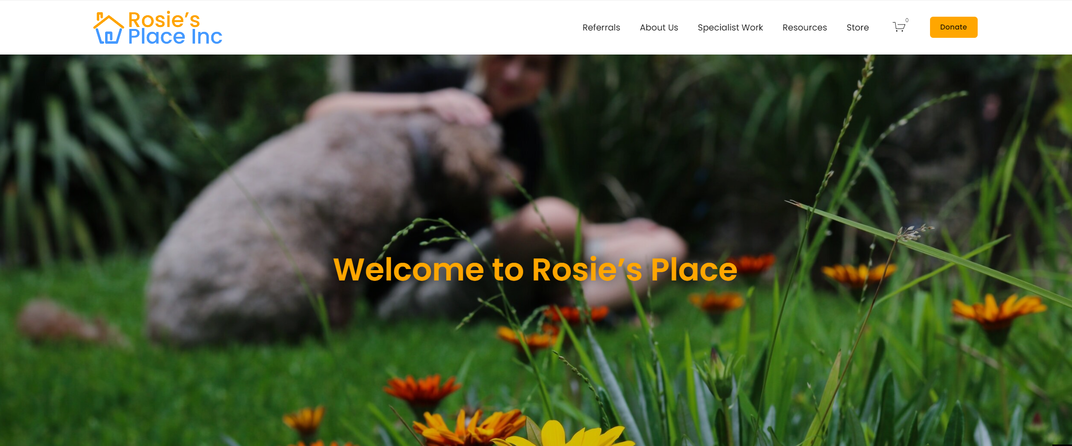
The logo is a modern redesign of the companies old icon, which was a children’s drawing of a house. The old imagery was well-liked by the company so I wanted to try and encapsulate that into a modern rendition. The website was built using Squarespace with heavily modified CSS and HTML in order to reach a more responsive design which they had seen in other contemporaries' websites that allowed for viewing on computer and phone. Rosie’s Place makes a few publications each year and wanted the ability to expand on book production with a user-friendly storefront that allows them to now sell books one-by-one as they were previously limited to word of mouth bulk ordering. Another addition that was required was the ‘Quick Exit’ button that is visible on their website. The button is used to quickly close the website and mask that the viewer has been to the website. This is done in consideration of domestic violence victims who may be searching for help on the web and allow them to quickly hide where they were.
The website features all original photography, from the header images to each of the store page product pages, the content was made in accordance with guidelines that Rosie’s Place set. A requirement for the imagery was to avoid any identifiable children in the photos, as many members of the management team felt it was always unfair to the child/ren that their image would be associated with abuse.
Rosie’s Place redesign was completely done as a solo project which afforded it a lot of its own challenges, I had to ask for help on more than one occasion. During many stages of the process, I reached out for peer reviews onto how the project looked and felt as Rosie’s Place wanted to avoid overt imagery restricting some of the visual outcomes that could easily convey what Rosie’s Place does. Overall, the project was delivered and received as a success by many of the clients and cousellors.


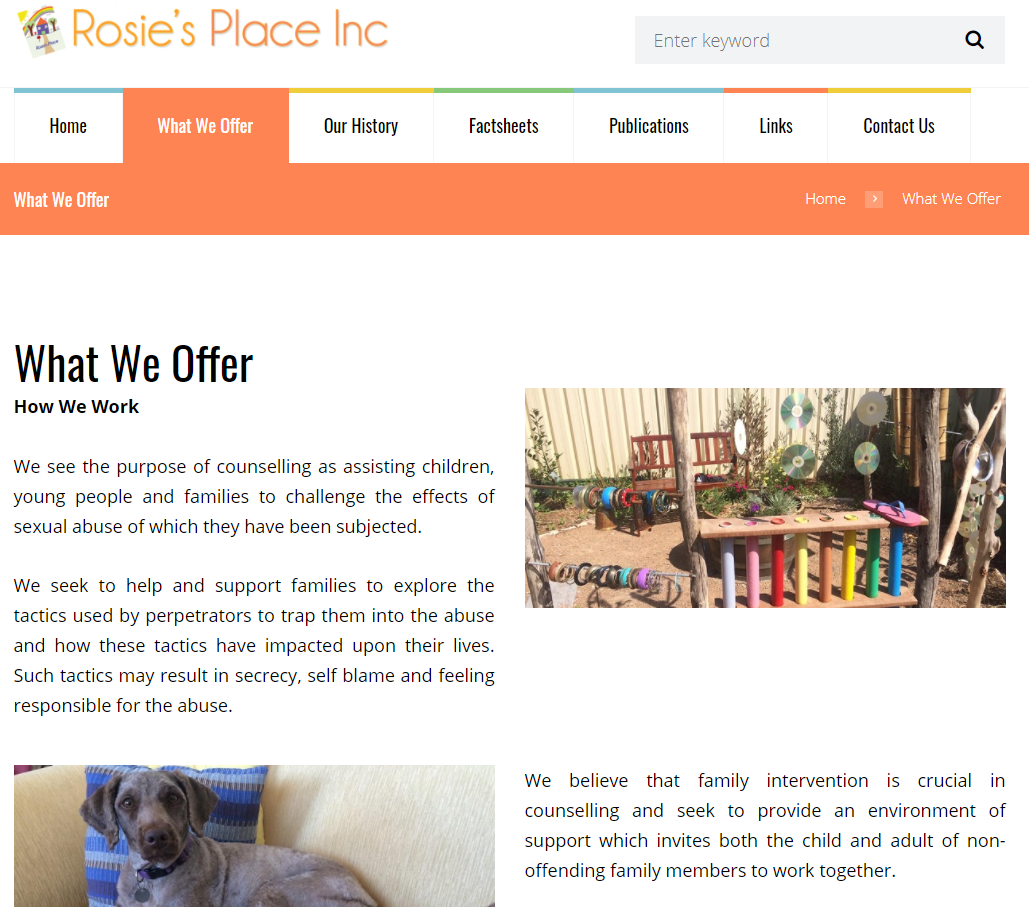
Before and After